Project 01
One Structure, Every Account
Designing Credit, Chequing, and Savings to work as one family.
One Structure Rules All
Project Details
- Company
- Neo Financial
- My Role
- Lead Designer
- Collaborators
- Head of Design, PM, Mobile Engineering
- Time Period
- June–September 2025 (4 months)
- Status
- Launched September 2025
Outcomes
-
+XX pts
Improved NPS score after launch
-
XX%
Improved discoverability of features
-
XX%
Reduction of payment questions to support
Overview
As Neo Financial continued to grow, its account experiences needed a refresh.
I led the design of Credit, Chequing, and Savings accounts, giving them a clearer, more consistent look with simple rules for where actions and features belong.


The Problem
The old tab-based layout made key information and features harder to find.
Support calls and in-app feedback kept pointing to the same issues:
- Card management was hard to find across chequing and credit accounts.
- Credit statements were difficult to locate, leading to customer support calls.
- Outstanding balances weren't always clear, leaving credit customers unsure of how much they owed.
- Upcoming features had no home. Features like joint chequing had no clear place in the old structure.









Everything Hid Behind the Same Three Tabs
The Approach
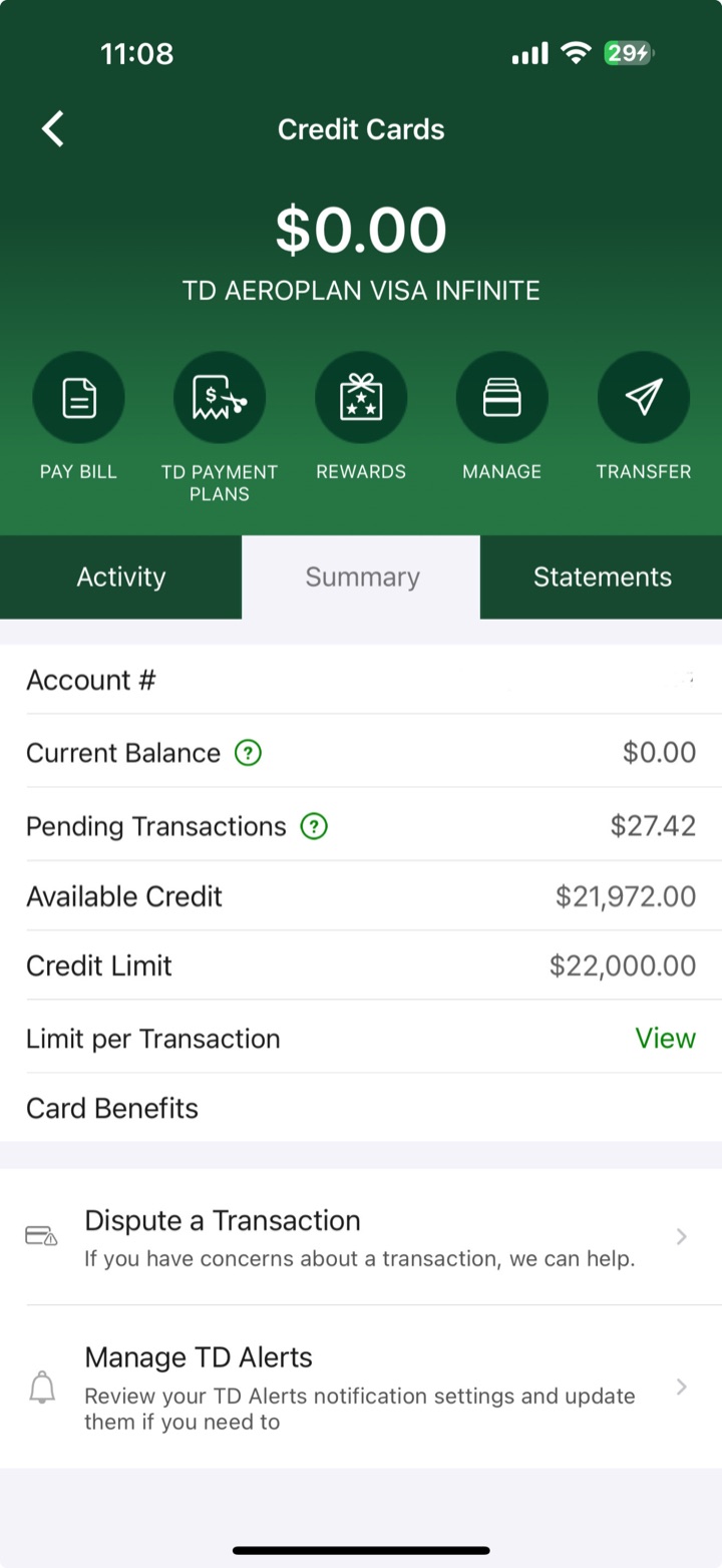
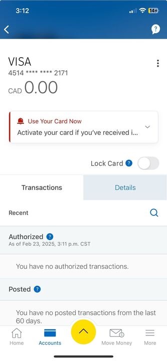
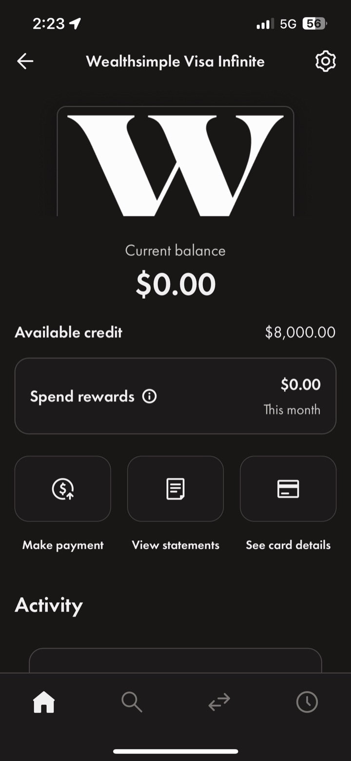
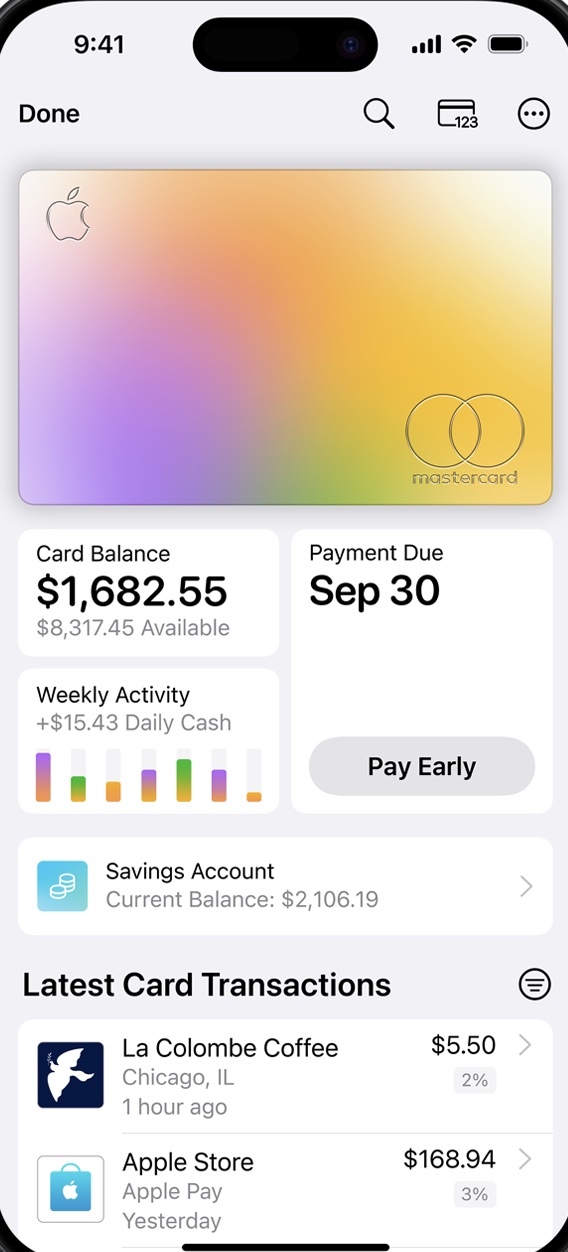
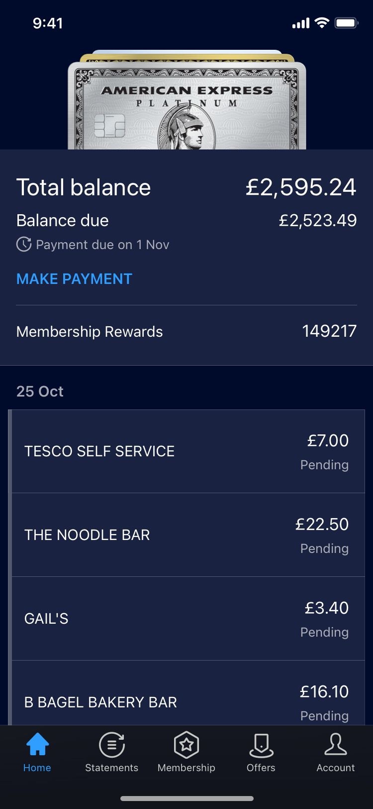
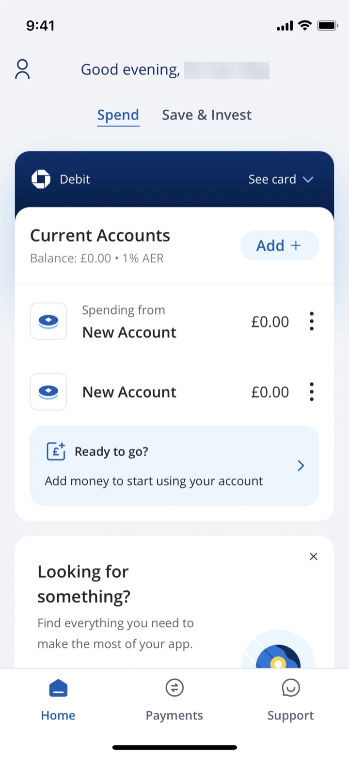
I started by studying how other financial apps solved the same problem.
I looked at how fintechs, big banks and other popular apps organized their accounts: their navigation, what they put first, and how people reached everyday actions.
Then I pulled the best ideas into something that fit Neo.


The Design / 01
Making everyday actions easier to find.
Everyday tasks were buried in tabs. Now they're one tap away.
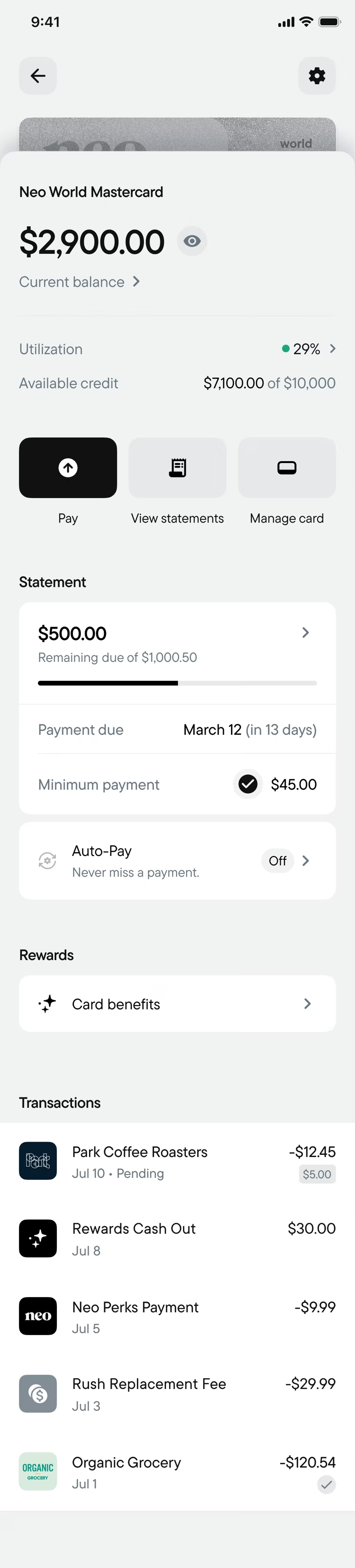
- Quick Actions Replace Tabs Pay, View Statements and Manage Card sit right under the balance.
- One Tap, Not Three Freezing a card or finding a statement no longer means digging through tabs first.
- Settings Where You Expect Them A gear in the header, like most modern fintechs and popular apps.
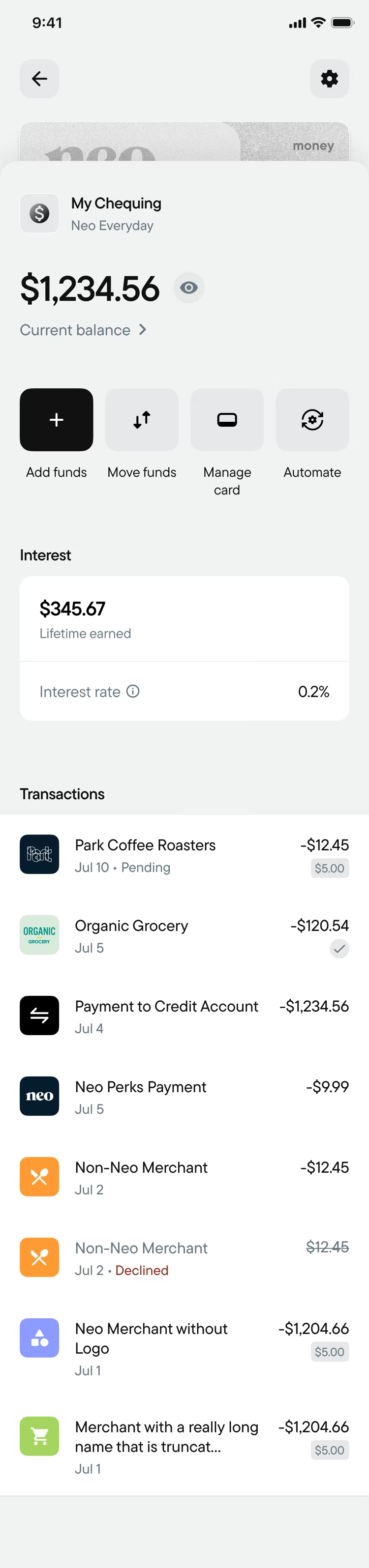
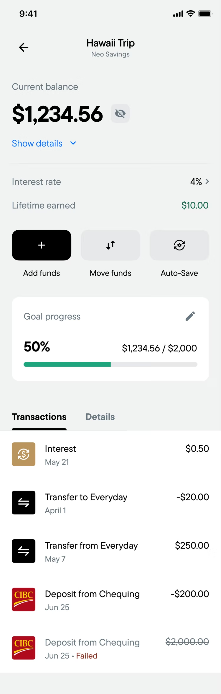
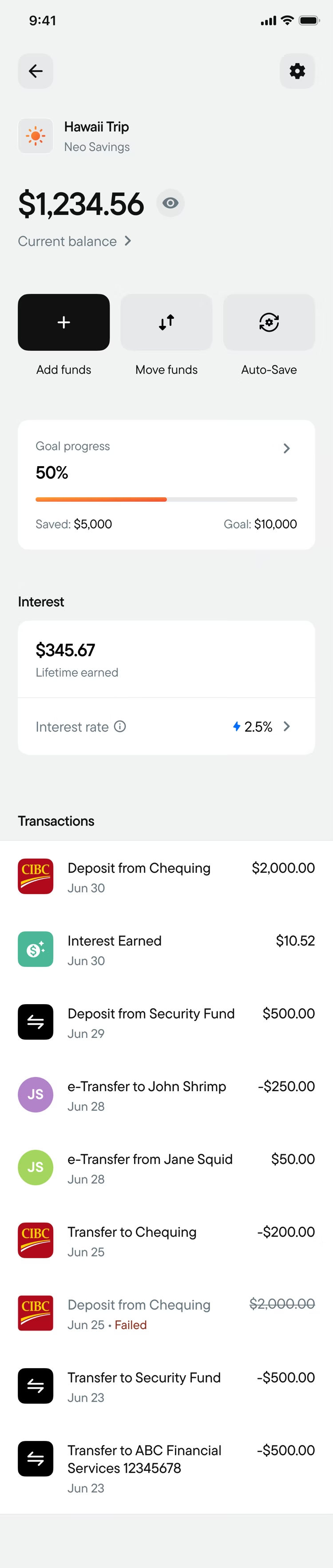
- Same Pattern on Every Account Chequing, Credit and Savings all work the same way.
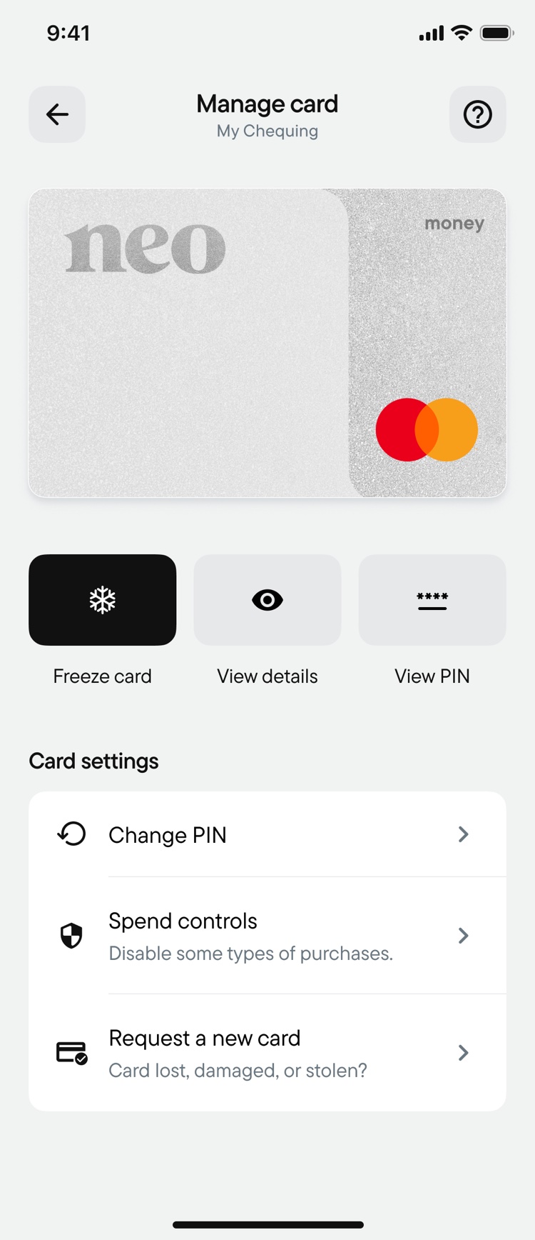
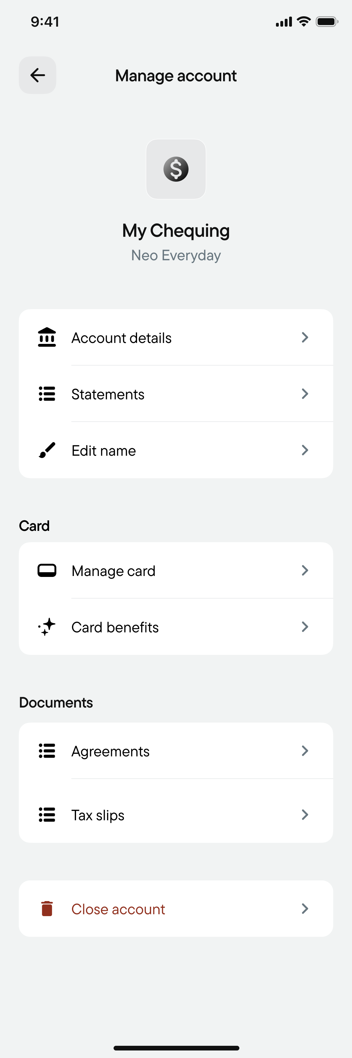
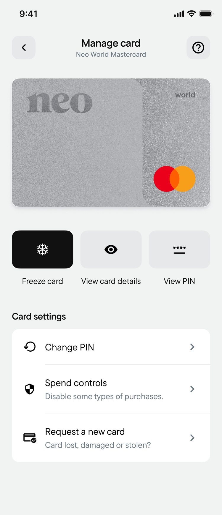
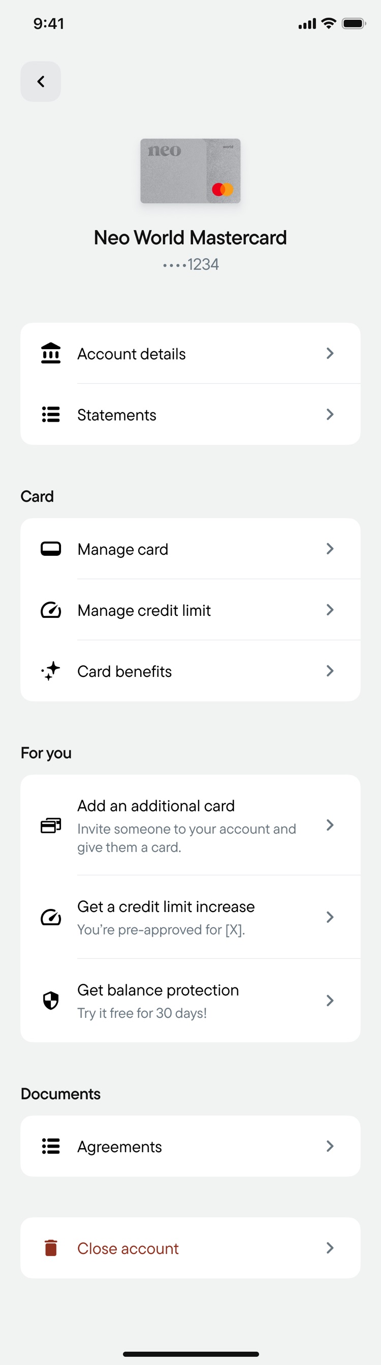
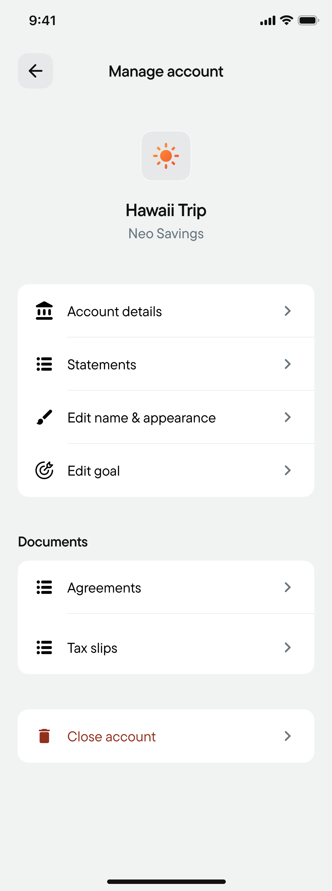
Tap the Card or Settings to Explore
The Design / 02
Making account information easier to understand.
Instead of rows of numbers, I explored more visual ways to show key account information.
For Credit, that meant indicators for available credit and utilization, plus a statement progress bar showing how much of the statement is paid, so customers understand their account at a glance.
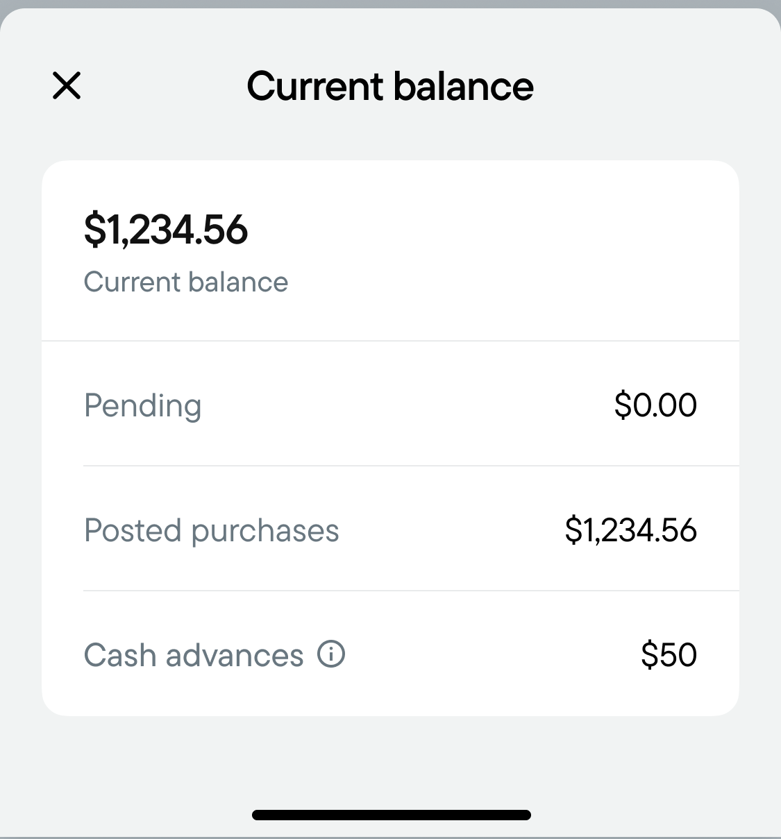
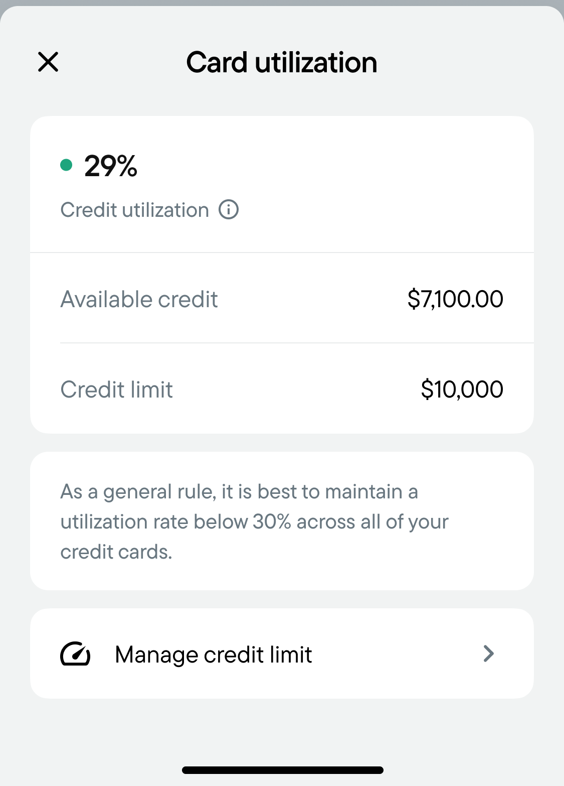
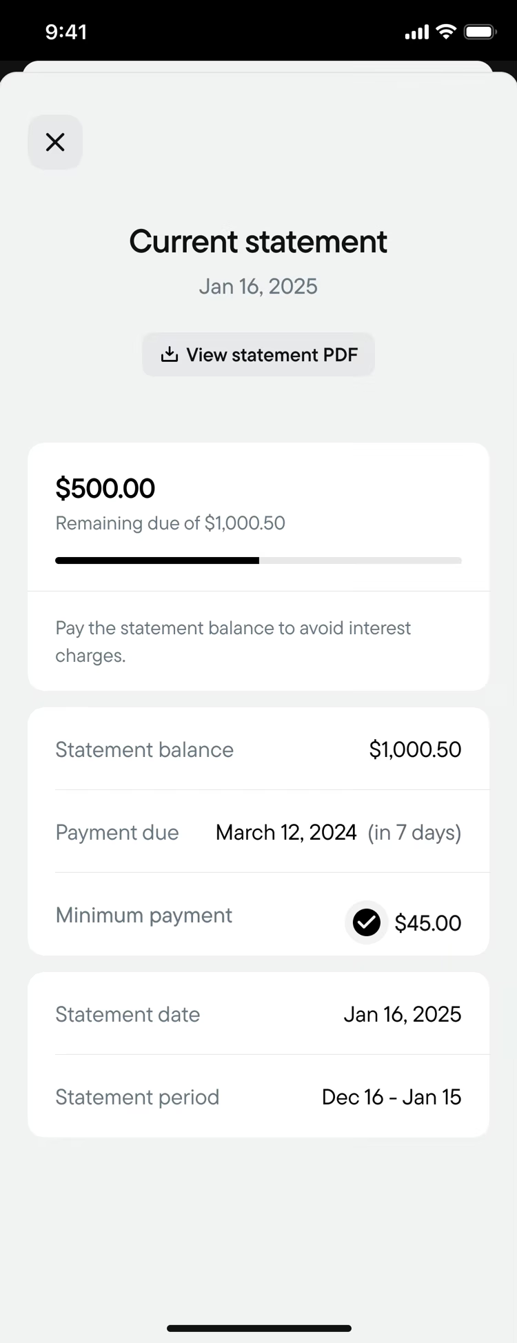

Tap Current Balance, the Utilization Arrow, or the Statement
The Design / 03
One structure, different accounts.
I built one information hierarchy for all of Neo's accounts, with room for each one's own features.
Savings can lead with interest and goals; Credit with payments, statements, and available credit.
Credit
- Card
- Settings
- Name & balance
- Quick actions
- Account-specific
- Transactions
The Design / 04
Making room for what's next.
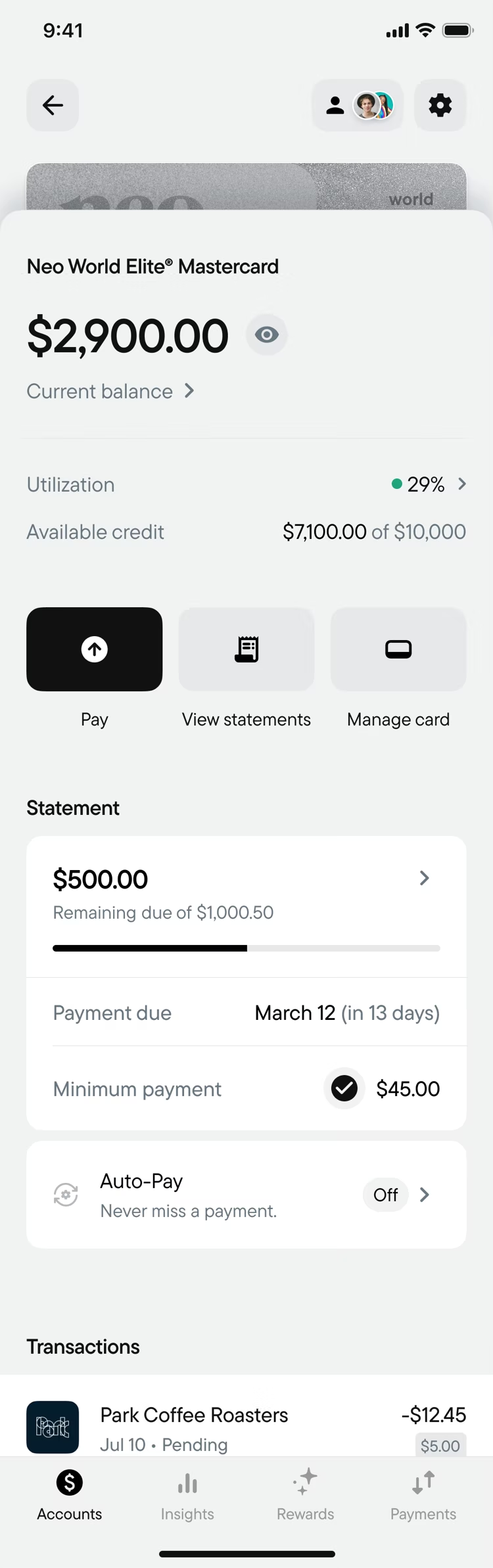
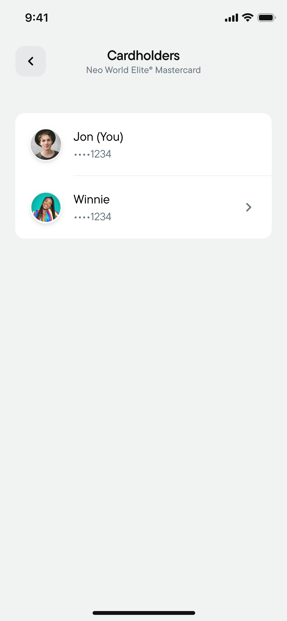
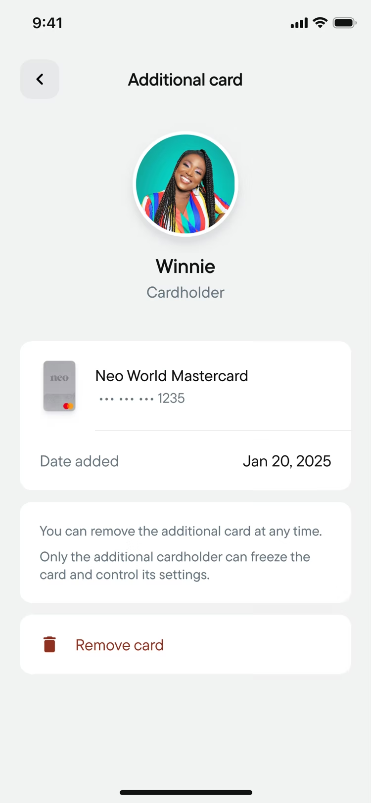
Joint accounts were coming, so the structure needed room for shared ownership.
I explored using member avatars in the account header, a familiar pattern from group chats, so joint accounts are easy to spot and members are a tap away.


The Outcome
One foundation, built to grow with Neo.
A refreshed visual direction made the accounts feel lighter and more modern: cards up top, clear balances, and everyday actions within reach.
And underneath, one shared structure keeps every account consistent, with room for new features like joint accounts.
Chequing, Credit and Savings
Reflections & Dissections
What I learned.
Using established patterns.
Building on patterns people already knew sped up the work and won stakeholder buy-in sooner.
A shared architecture is harder than it sounds.
Most of my exploration came down to balancing each account's own needs against one structure that works for all of them. But the result is a family of accounts that belong together: learn one, and you know the rest.
I wish you a fantastical day,
Eddie Marroquin